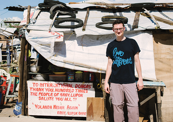
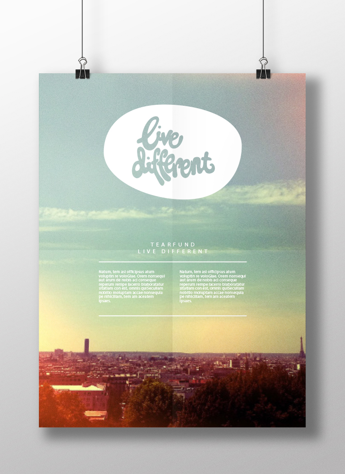
Live Different
Client: Tearfund
Role: Concept, graphic design.
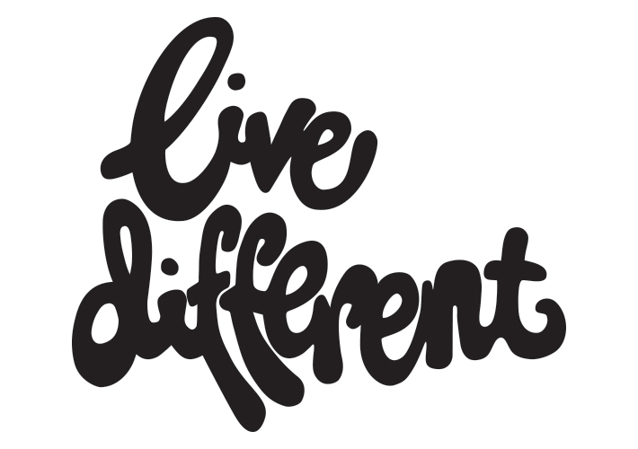
A quick job for Tearfund’s youth and emerging generation team. The brief was to create a unique typographic lock-up using the words ‘Live Different’ that could be applied to posters, tshirts and other material. Direction from the Tearfund team involved the use of rounded, curvacious type.
The result was created from a little hand drawn lock up by my wife – and since named Sarah’s Curves. It is playful, simple, distinctive and 100% unique. The hand-drawn type creates a sense of fun personality and individualism, whilst also hinting at graffiti tags, which helps to draw out the potentially provocative nature of the statement.