Kings Church Brand and Publicity
Client: Kings Church, Bangor
Role: Concept, Graphic Design
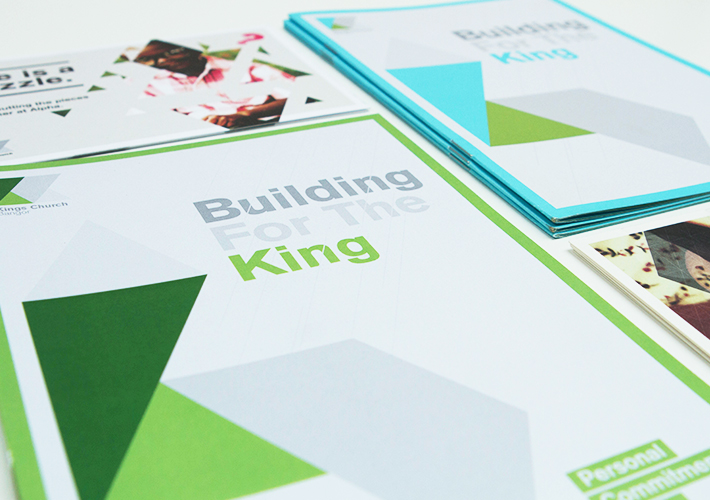
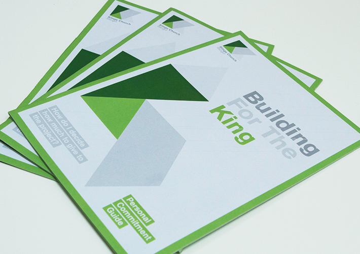
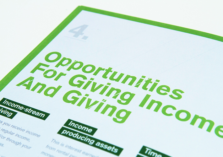
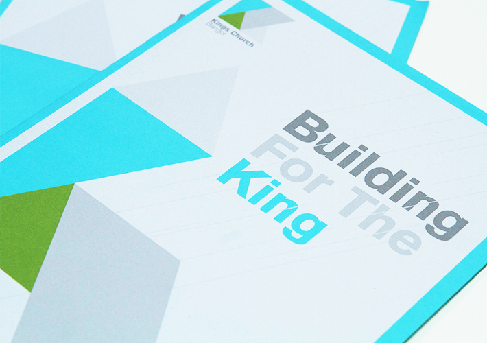
Something more structured and formal than my usual style, the new Kings Church brand and associated materials are purposefully strong and directional reflecting the church’s purpose, with a colour palette drawn from the mountains and sea that form the setting of the church community.
The logo is made up of various shapes that form an abstract K and C – these shapes also devolve to form various graphic devices, like a church steeple to help illustrate the building project booklets that acompanied the launch of the new brand.